How relevant are traditional color forecasts today?
As a trend researcher and designer I am asking myself more often, how we could work with color more sustainably and meaningful.
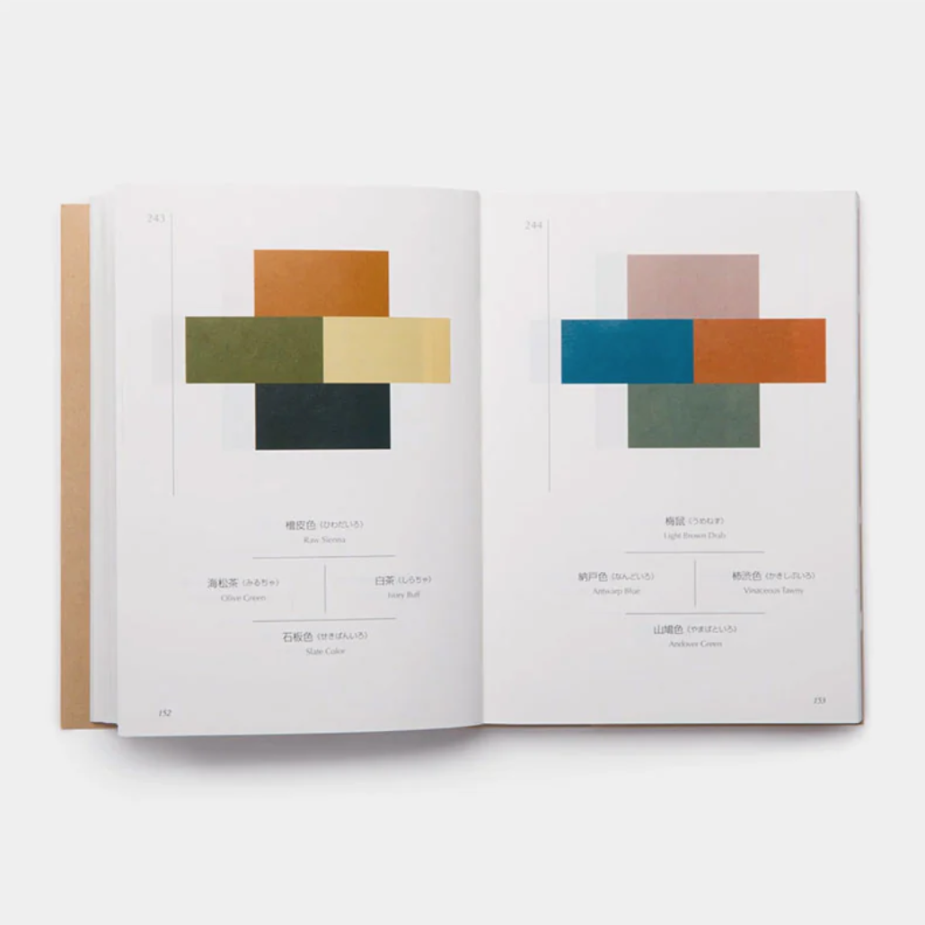
What if we approached color the way Sanzo Wada did in A Dictionary of Color Combinations,using it as a guide to create distinctive, timeless color concepts rather than chasing fleeting trends?
Globalization has turned color increasingly into a consumer-oriented product, “must-have” shades with an expiration date. Countless annual trend reports shape our desires, spark wants we didn’t even know we had, and fuel a constant sense of FOMO fear of missing out.
That’s why Wada’s little book feels so refreshing. This purely visual reference, with 348 color combinations, draws entirely from nature. The pairings are surprising, unconventional, and curiosity-inspiring, completely free from rules, conventions, or scientific rigidity.
Its growing popularity, recently noted in the Dutch newspaper Volkskrant, shows how timeless Wada’s approach remains. For him, it wasn’t about giving strict rules for combining colors, but about an intuitive approach, offering inspiration rather than instruction.
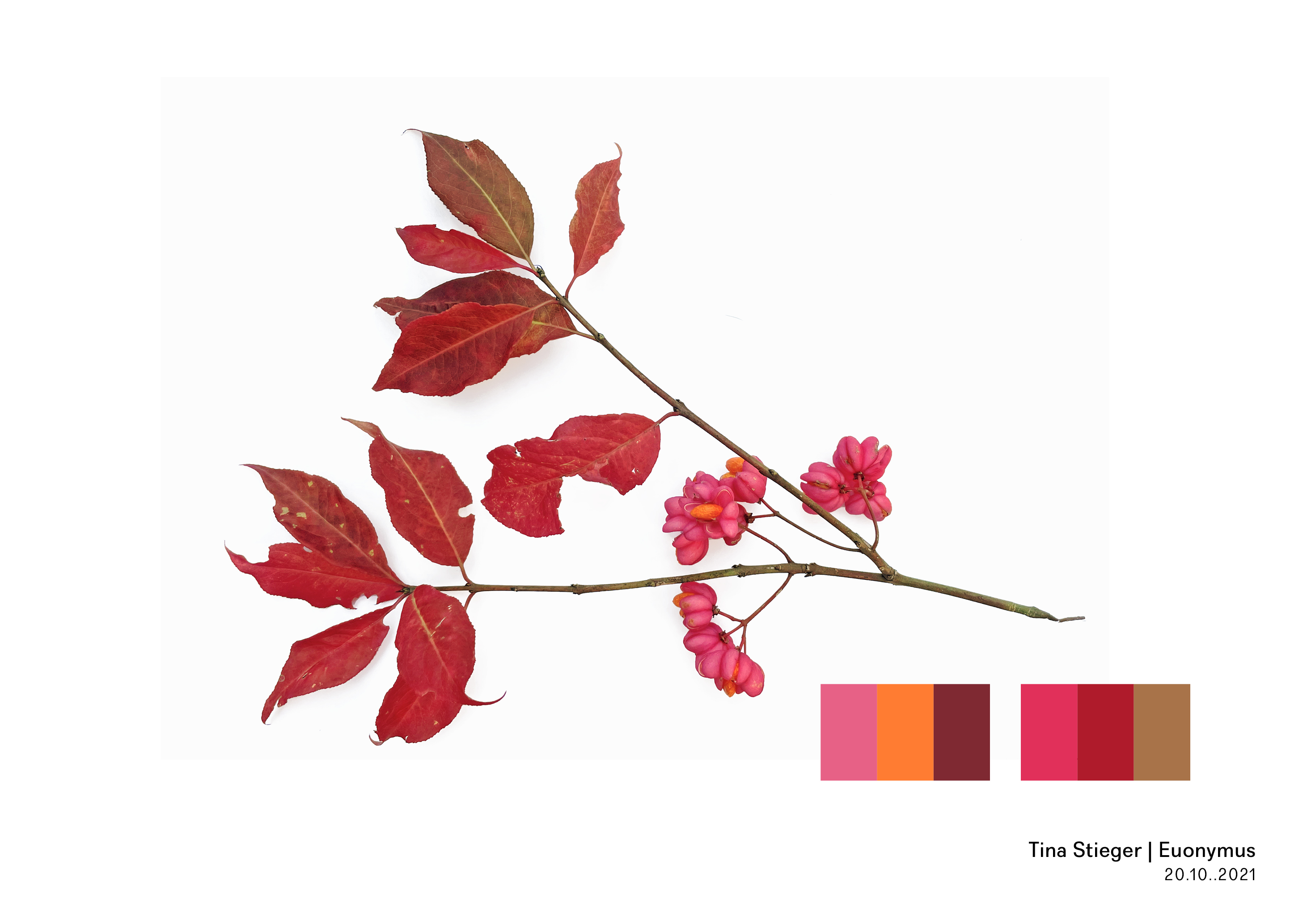
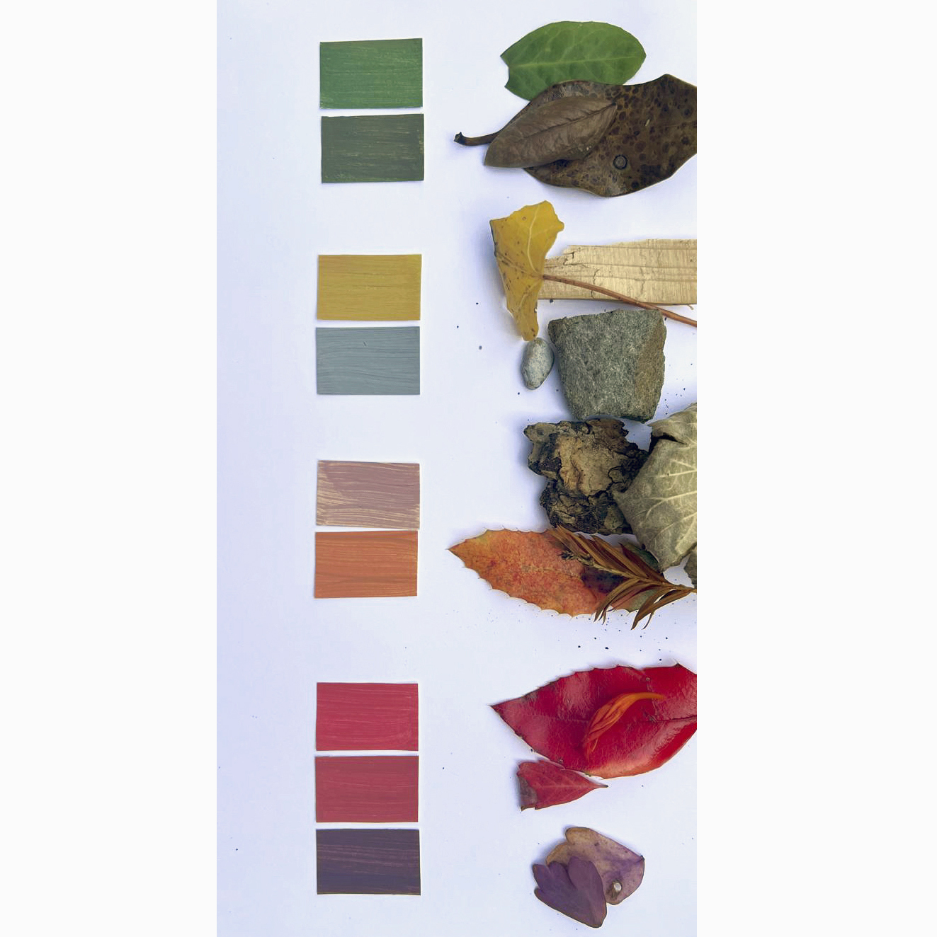
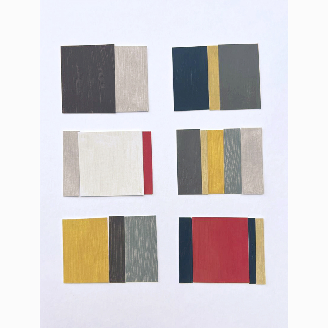
In my own work, I try to do the same: observing color where it naturally occurs, in nature, light, materials, and textures, and translating these observations into palettes that remain connected to their origin and context. Not following trends, but creating timeless color palettes based on durable esthetic principles.
Image 1:A Dictionary of Color Combinations
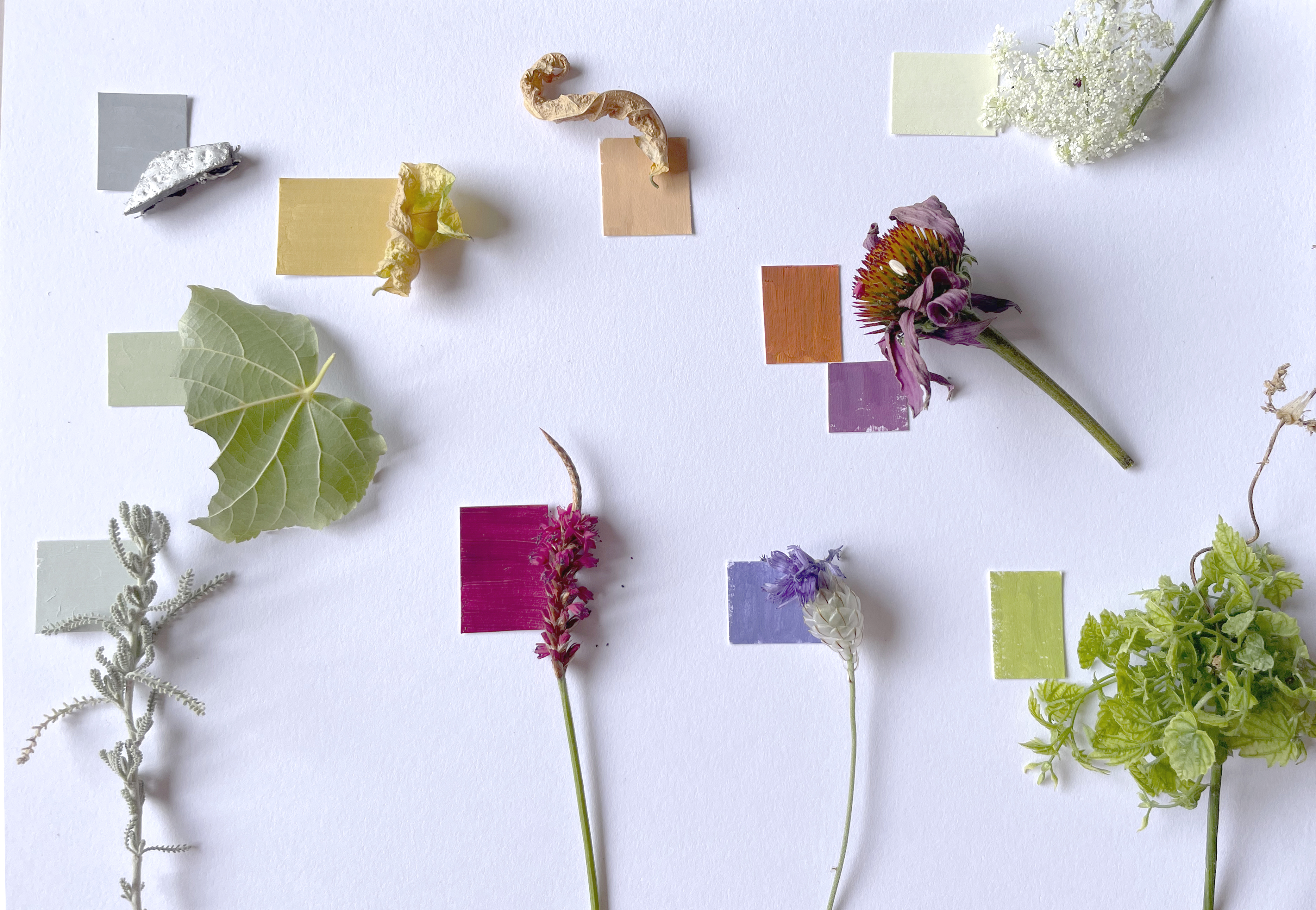
Images 2–3: My own color research
15.09.2025
What happens when we let intuition guide us in working with colour?
And what emerges when play becomes the common thread in discovering, exploring and creating?
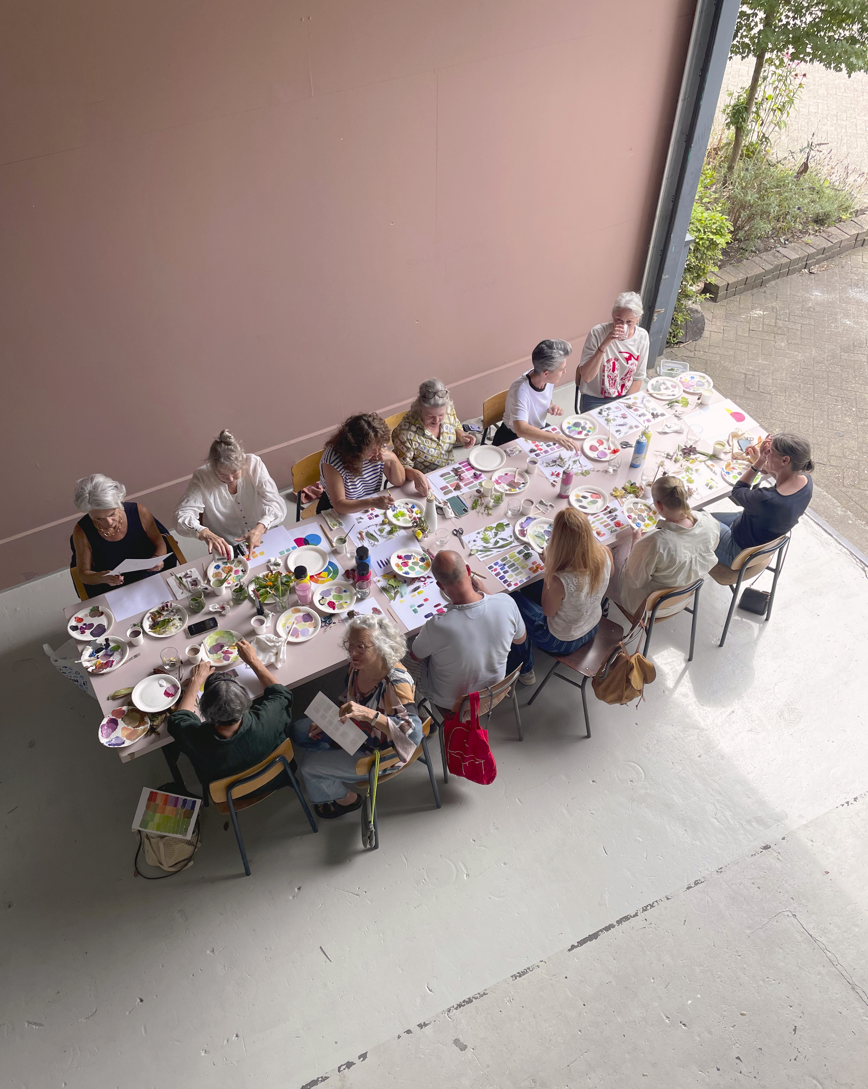
Over the past year, I’ve guided several colour workshops where participants went through their own process, from intuitively sensing colour to composing personal palettes and visual stories. Whether fashion students, garden enthusiasts, interior architects or textile designers, one insight kept resurfacing: intuitive colour choices open up stories, spark dialogue and create unexpected connections across disciplines.
In the coming months, I’ll be shaping the new Embassy of Colour program for next year – with workshops at inspiring locations, full of discovery and new collaborations.
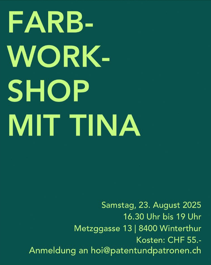
10.08.2025 For all the spontaneous & curious On August 23rd, I’ll be hosting a special colour workshop in Winterthur – at Eva’s brand-new store, @patentundpatronen.
• Are you working on a personal project? • Do you want to learn how to create your own colour palette? • Or simply enjoy an inspiring evening in a friendly group?
Then join us!
What to expect: Discover the hidden colours of the city. After a short introduction, we’ll go on a colour exploration tour – observing, collecting, and combining. At the end, you’ll take home your own colour cards & palette.
What if your next colour concept didn’t come from a trend forecast or Pinterest board… but from a walk around the block or your garden?
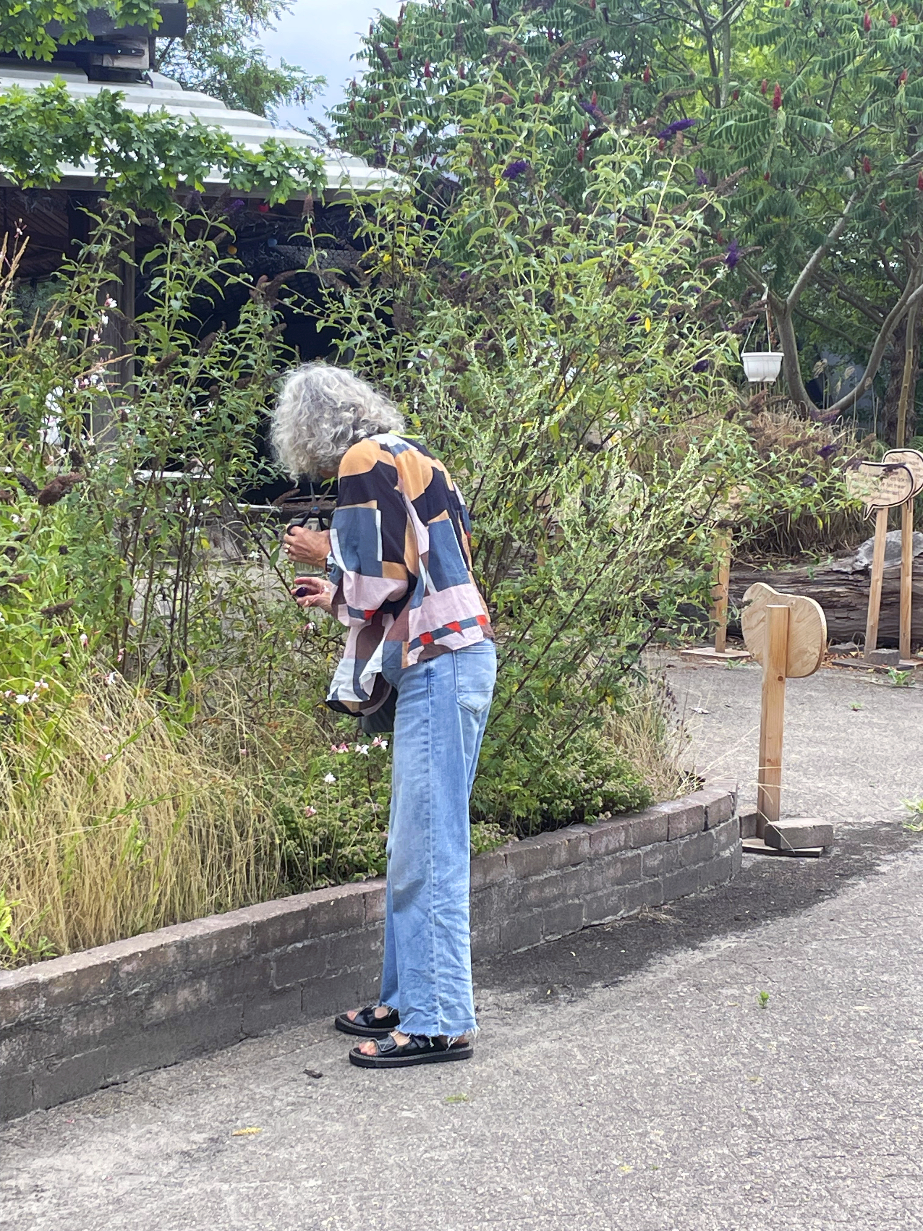
Lately, I’ve been focusing on how we can experience colour in a more hands-on and intuitive way — moving away from seasonal palettes or algorithmic suggestion, and instead connecting colour to real environments and materials. How can we make colour more tactile, personal and grounded in place?
This approach has shaped my recent workshops and projects within my Embassy of Colour, where I’ve discovered colour’s power as a bridge between people, places, materials, and forms.
Images: Colour Workshop in July at Sectie-C in Eindhoven