ABOUT

Swiss-born Tina Stieger is a product designer specializing in colour and materials. She has further a background in trend research and forecasting.
From her studio in Eindhoven, she develops projects that go beyond mere aesthetics, delving into the cultural, social and ecological context of colour to provide more meaningful and sustainable perspectives of colour for the future.
She shares her expertise through educational programs, workshops, lectures, and tailored consultancy services for organizations and companies.
Tina Stieger holds a degree in Industrial Design and a Master of Arts in Design with a specialisation in Trends from the University of the Arts ZHdK Zurich.
Tina Stieger
Designer in Colour & Materials
Overakker 83
5629 CM Eindhoven
tina[at]tinastieger.com
KVK-Nr. 80791158
BTW NL003488294B59
WORKSHOPS & LECTURES
︎HOME
Embassy of Colour offers inspirational lectures and hands-on workshops that explore colour through observation, cultural context, and sensory experience.
Whether you're a creative team seeking new perspective, or an educational institution wanting to engage students through nature-based exploration, each session is tailored to your context — sparking new ways of seeing, thinking, and working with colour.
WORKSHOPS
︎︎︎WORKSHOP SESSIONS
NEW DATES FOR 2026 COMING SOON
Would you like to learn how to turn your surroundings into a seasonal colour palette?
Join this workshop to explore, collect, and create with colour in a new, intuitive way.
€42.00
︎︎︎ MORE INFORMATION
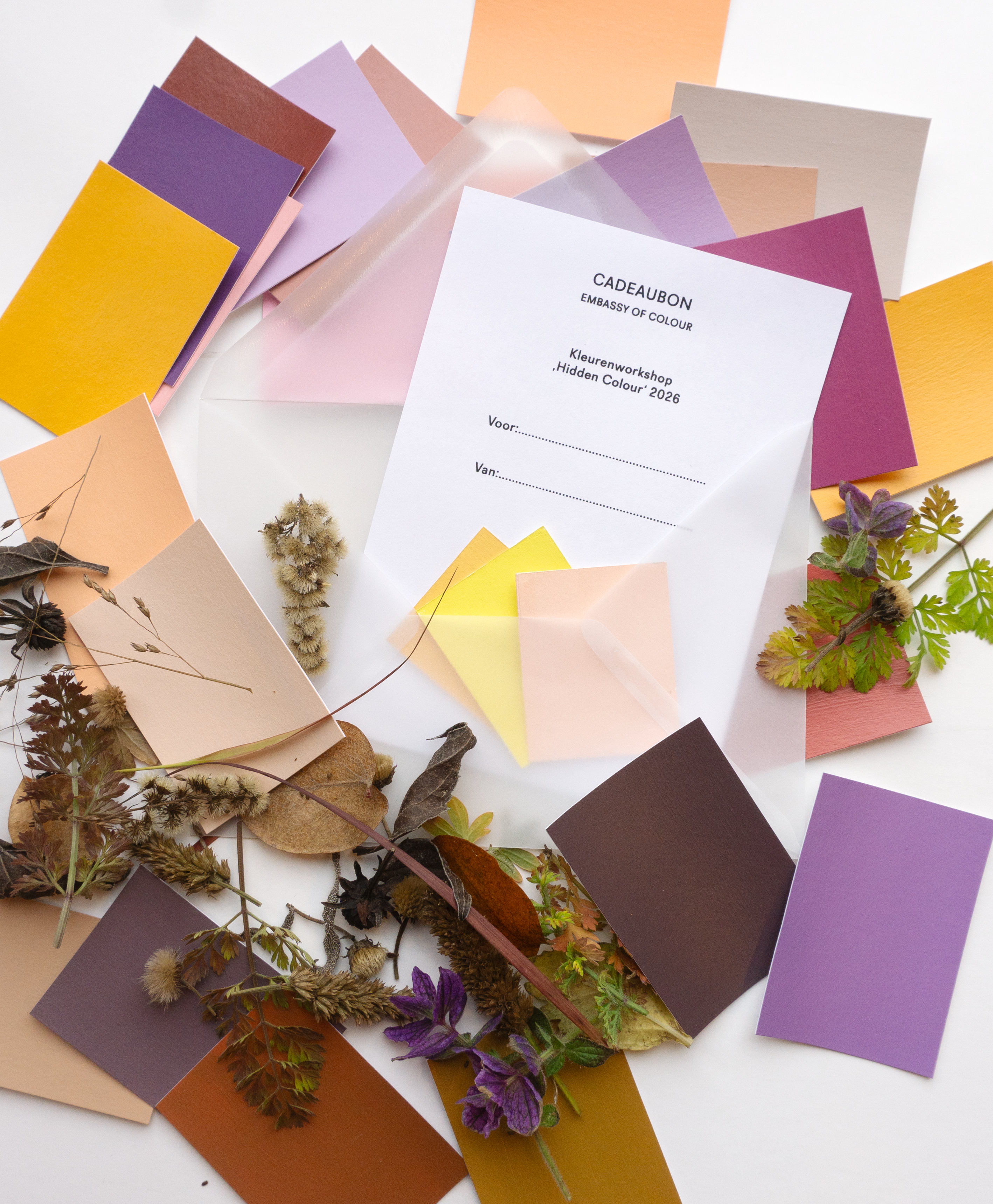
GIFT VOUCHER
GIVE COLOUR AS A GIFT
Are you looking for a personal gift?
Surprise your friends, family or colleagues with a gift voucher for one of my colour workshops “Hidden Colours” in Eindhoven.
The gift voucher can be used for all workshops in 2026, so the recipient can choose the experience that suits them best. Locations and dates will follow shortly.
Price workshop (incl. delivery costs within the NL): €45.00
Send me a mail for more details ︎
TESTIMONIALS
︎︎︎“Tina, an expert in colour and design, teaches you to look and discover with a healthy dose of curiosity.
In the Hidden Colours workshop, we learned how to truly perceive the subtle colours of nature, collect them, and transform them into personal colour palettes. It opened my perspective and helped me find my own way of seeing and working with colour.”
Participant “Enjoyed the whole experience and was reminded that my work is about just doing, trusting the process that something will emerge—and above all, playing.”
ParticipantGET IN TOUCH
︎︎︎If you’re interested in learning more about other workshop formats
or if you want to collaborate.
Send me a mail ︎
JOURNAL
︎HOME
15.08.2025
How relevant are traditional color forecasts today?
As a trend researcher and designer I am asking myself more often, how we could work with color more sustainably and meaningful.
What if we approached color the way Sanzo Wada did in A Dictionary of Color Combinations,using it as a guide to create distinctive, timeless color concepts rather than chasing fleeting trends?
![]()
Globalization has turned color increasingly into a consumer-oriented product, “must-have” shades with an expiration date. Countless annual trend reports shape our desires, spark wants we didn’t even know we had, and fuel a constant sense of FOMO fear of missing out.
That’s why Wada’s little book feels so refreshing. This purely visual reference, with 348 color combinations, draws entirely from nature. The pairings are surprising, unconventional, and curiosity-inspiring, completely free from rules, conventions, or scientific rigidity.
Its growing popularity, recently noted in the Dutch newspaper Volkskrant, shows how timeless Wada’s approach remains. For him, it wasn’t about giving strict rules for combining colors, but about an intuitive approach, offering inspiration rather than instruction.
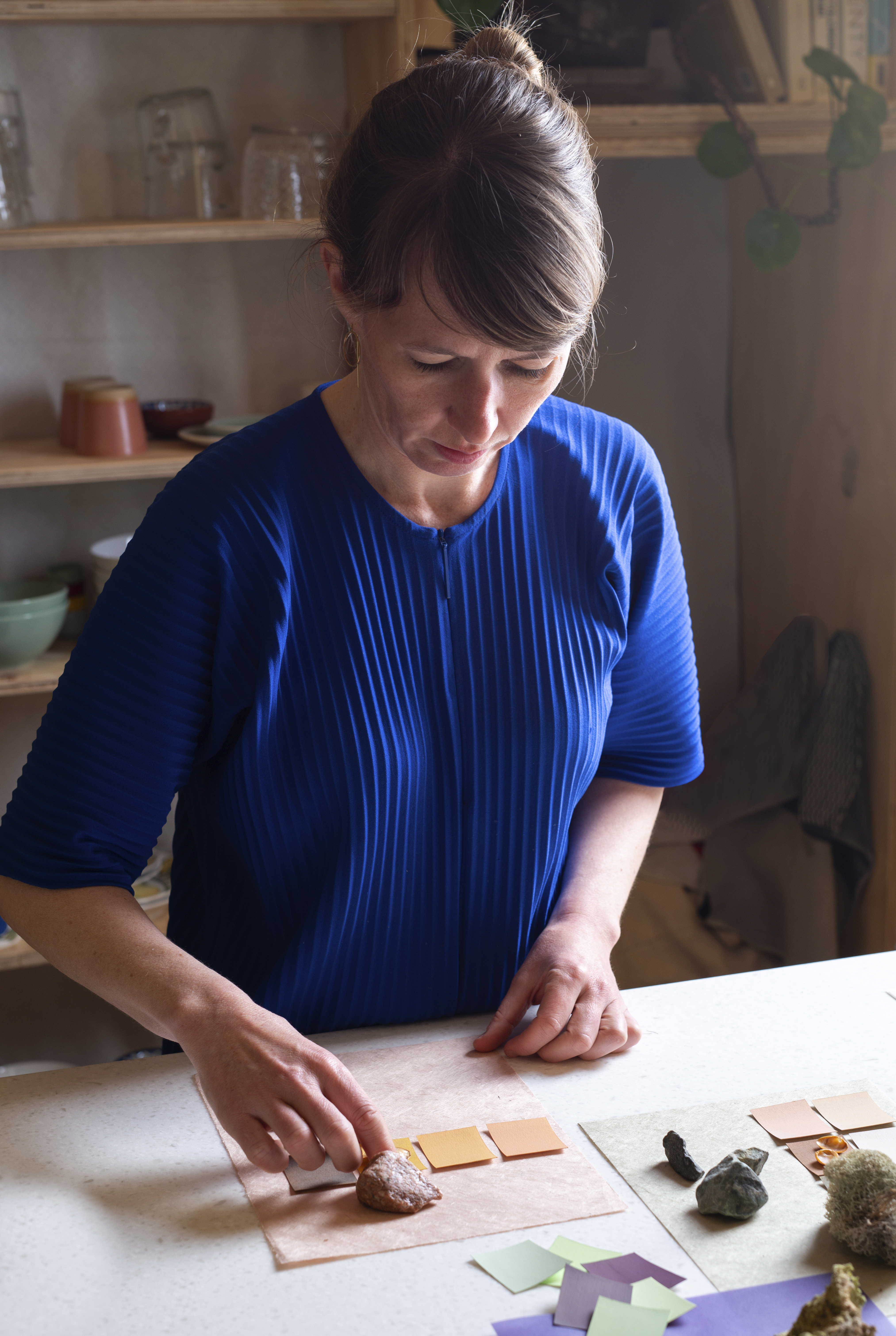
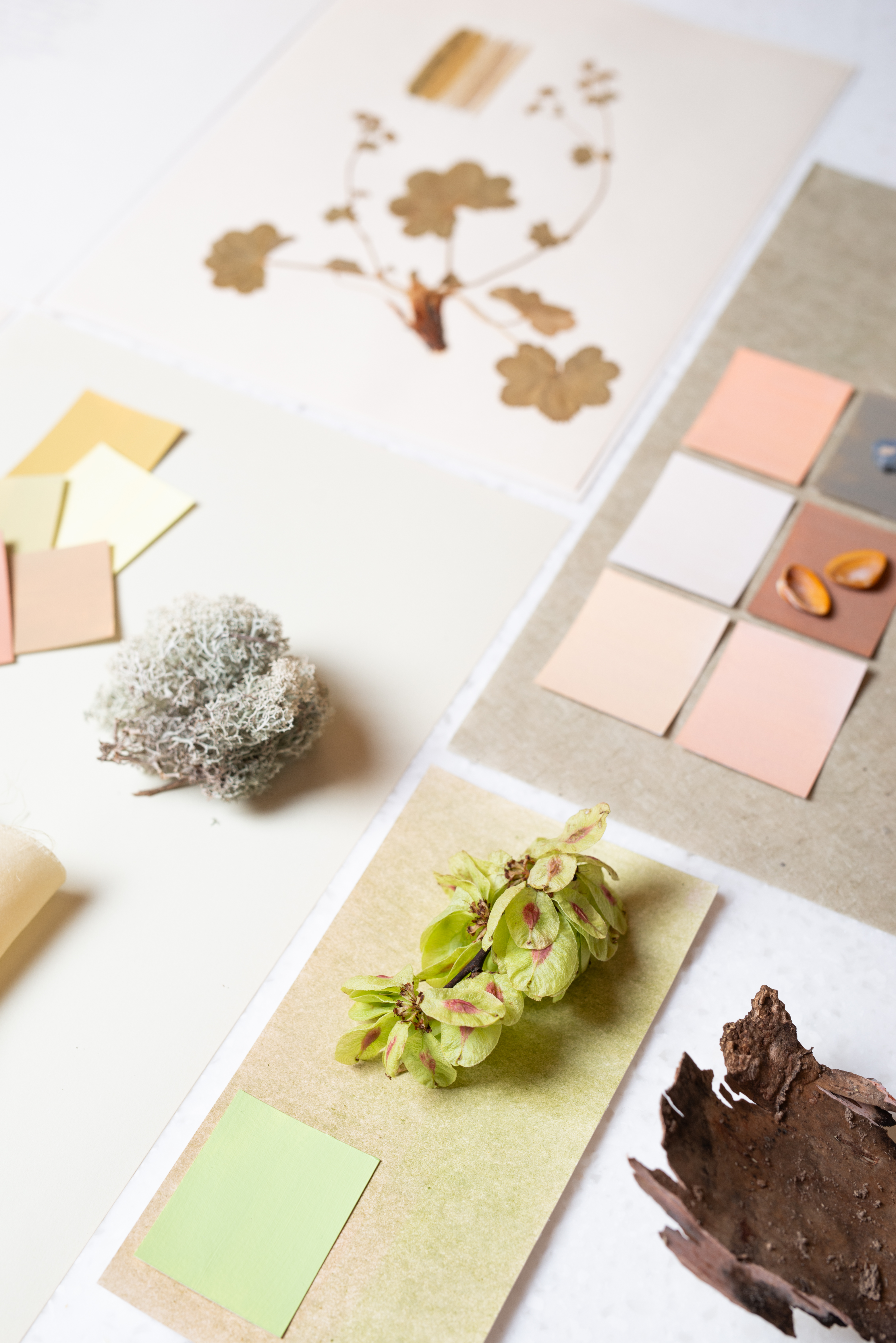
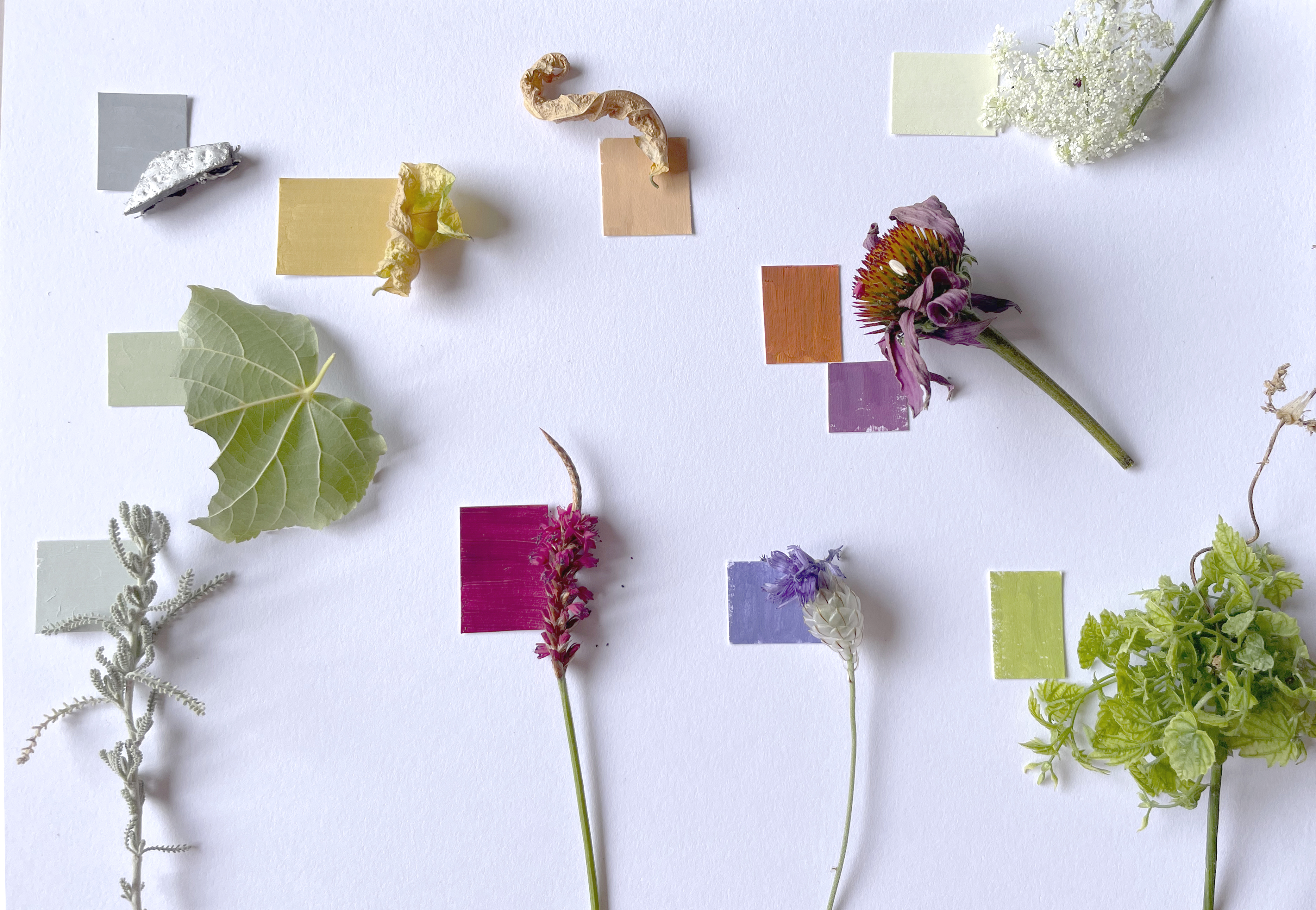
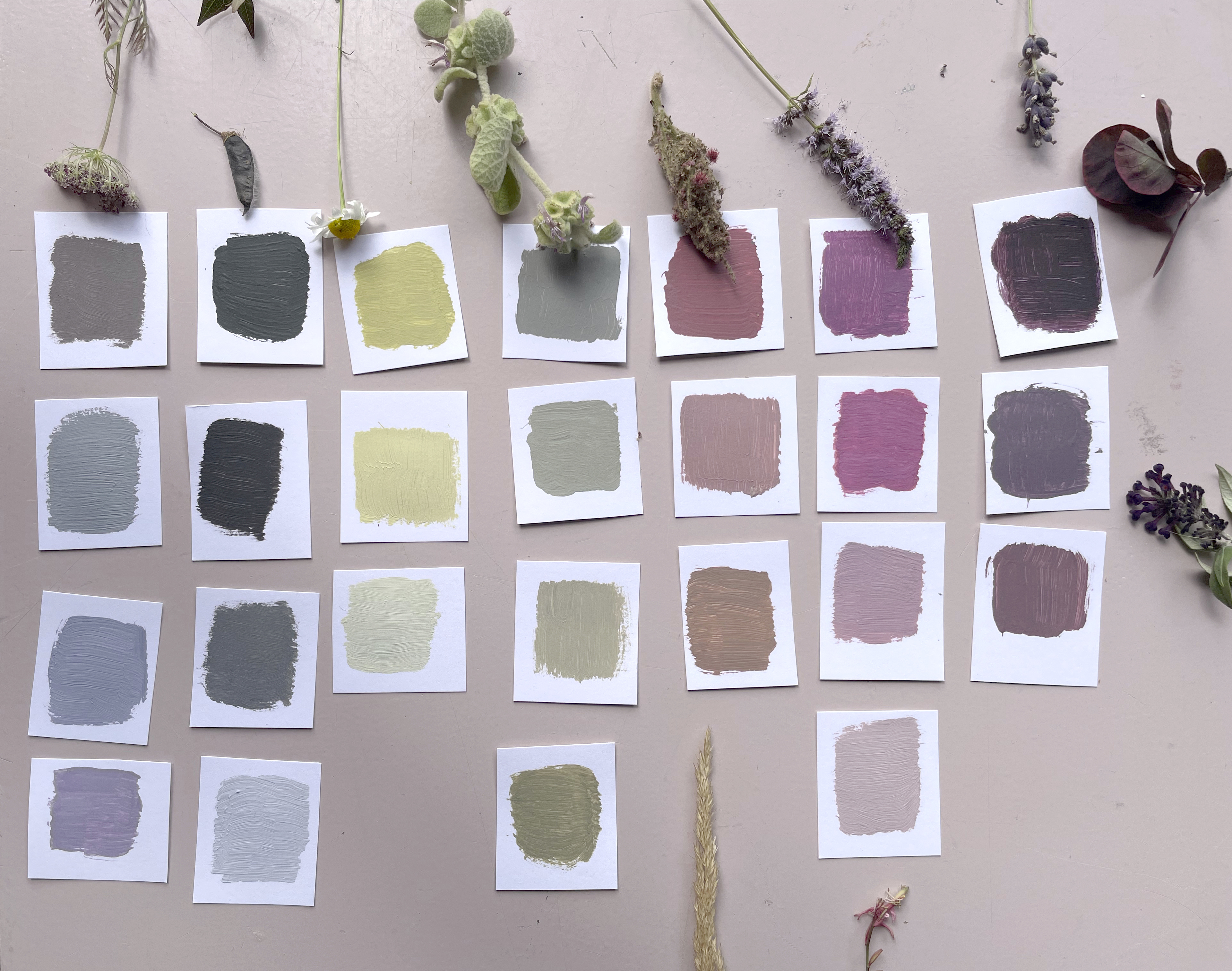
In my own work, I try to do the same: observing color where it naturally occurs, in nature, light, materials, and textures, and translating these observations into palettes that remain connected to their origin and context. Not following trends, but creating timeless color palettes based on durable esthetic principles.
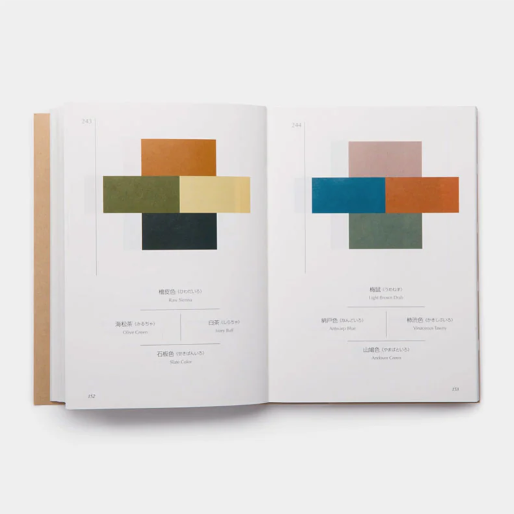
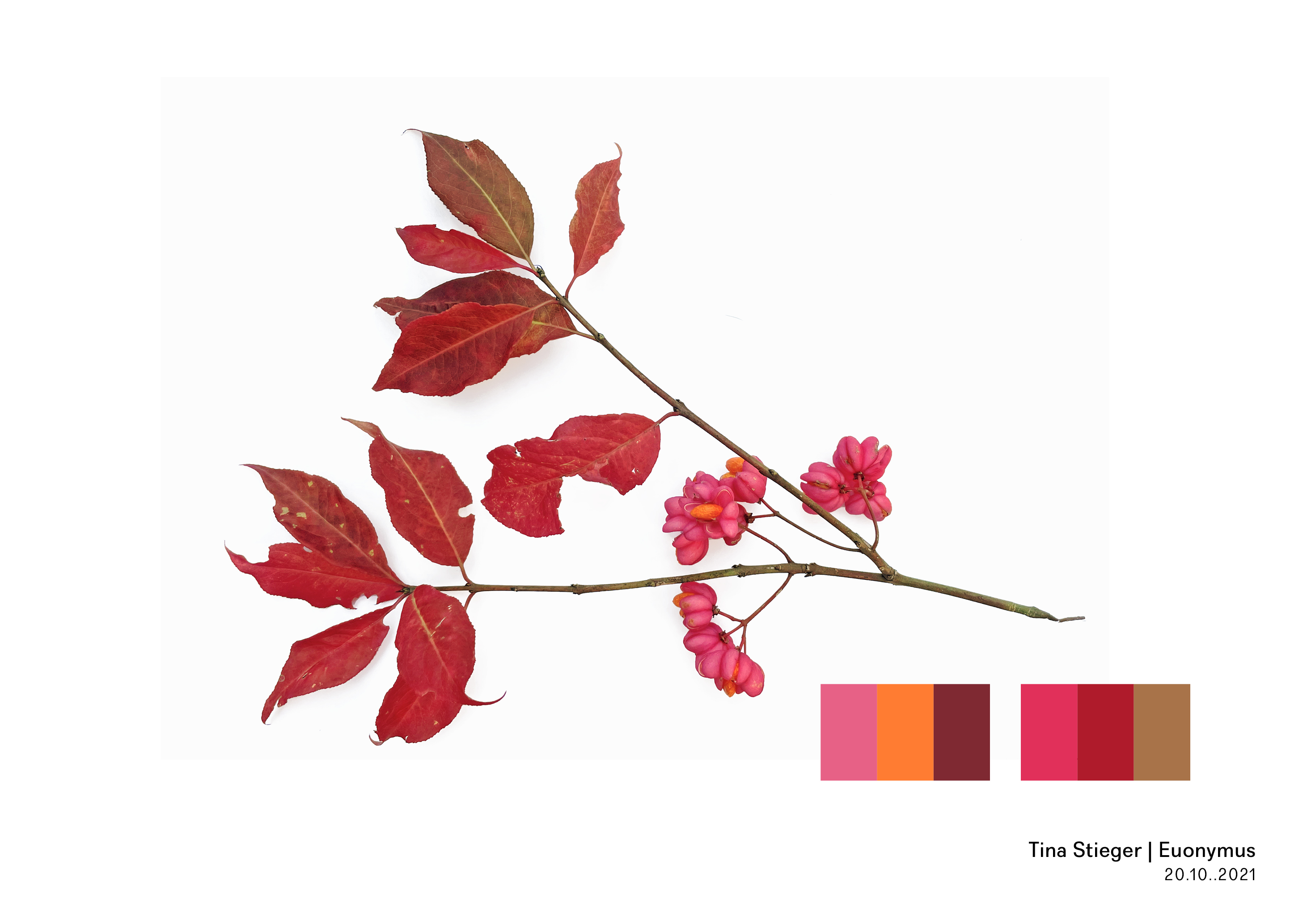
Image 1:A Dictionary of Color Combinations
Images 2–3: My own color research

15.09.2025
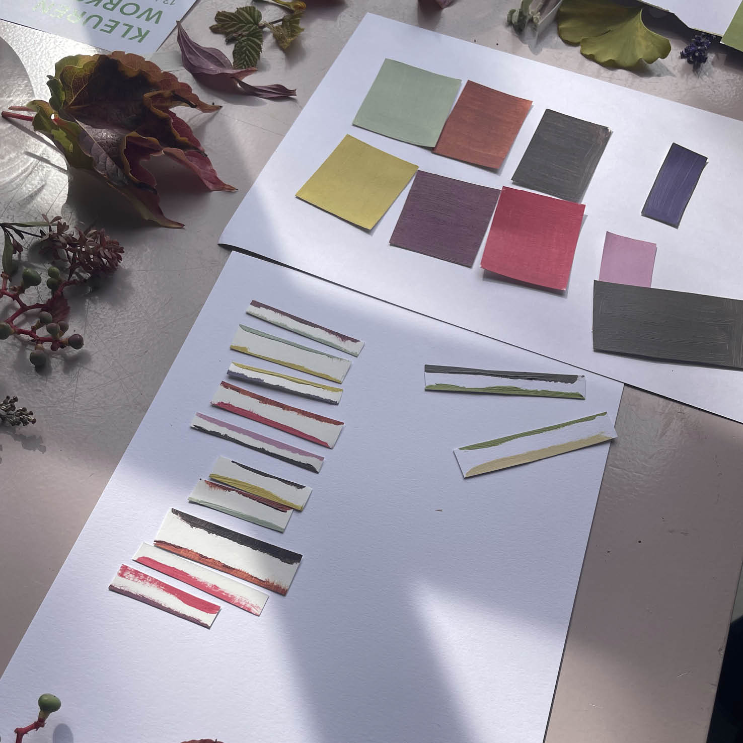
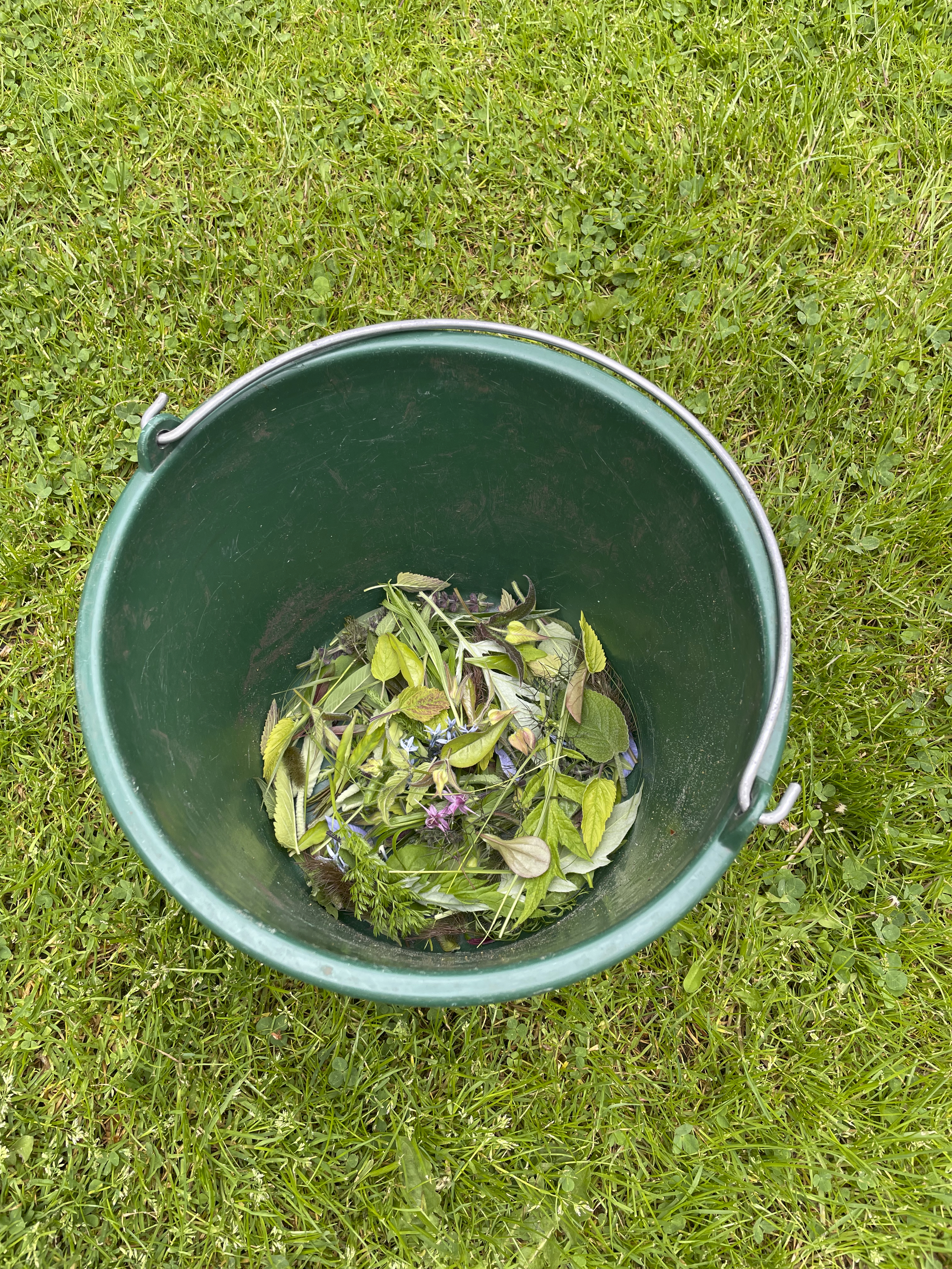
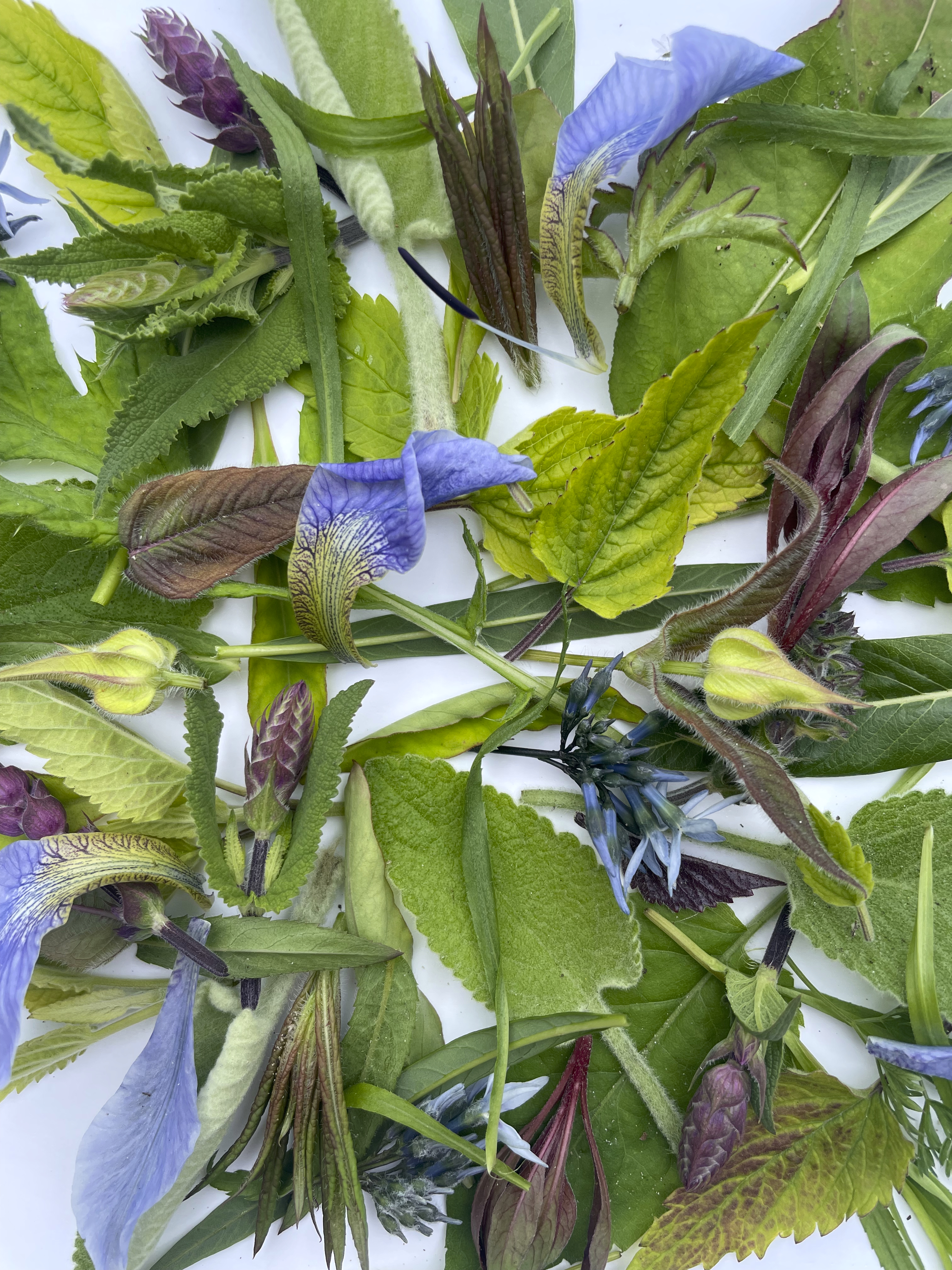
What happens when we let intuition guide us in working with colour?
And what emerges when play becomes the common thread in discovering, exploring and creating?
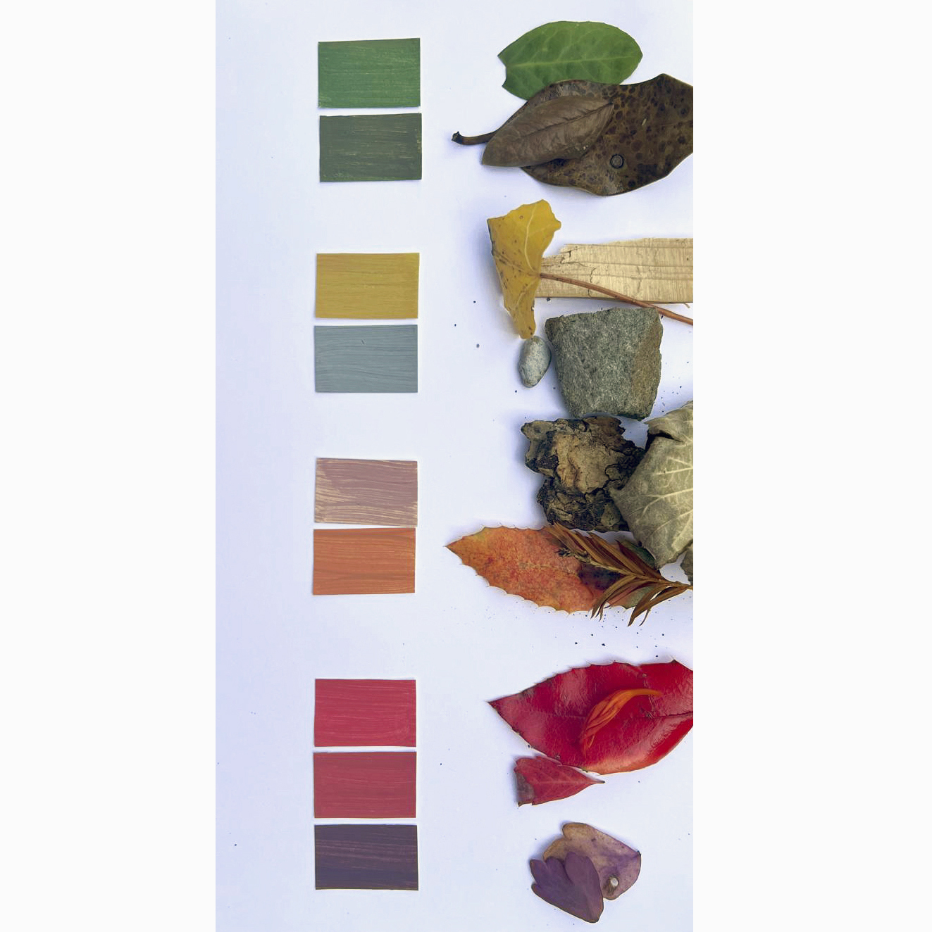
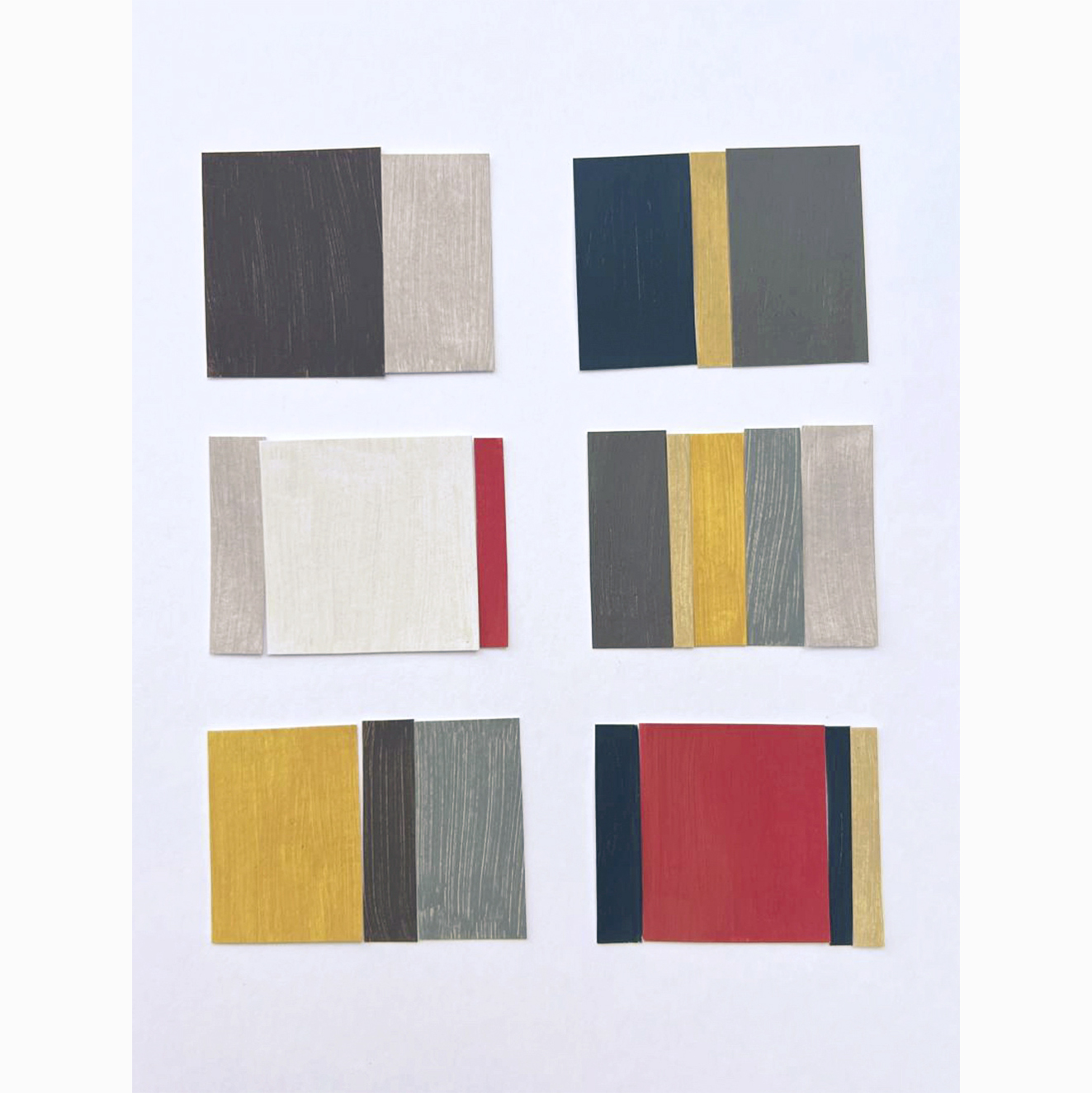
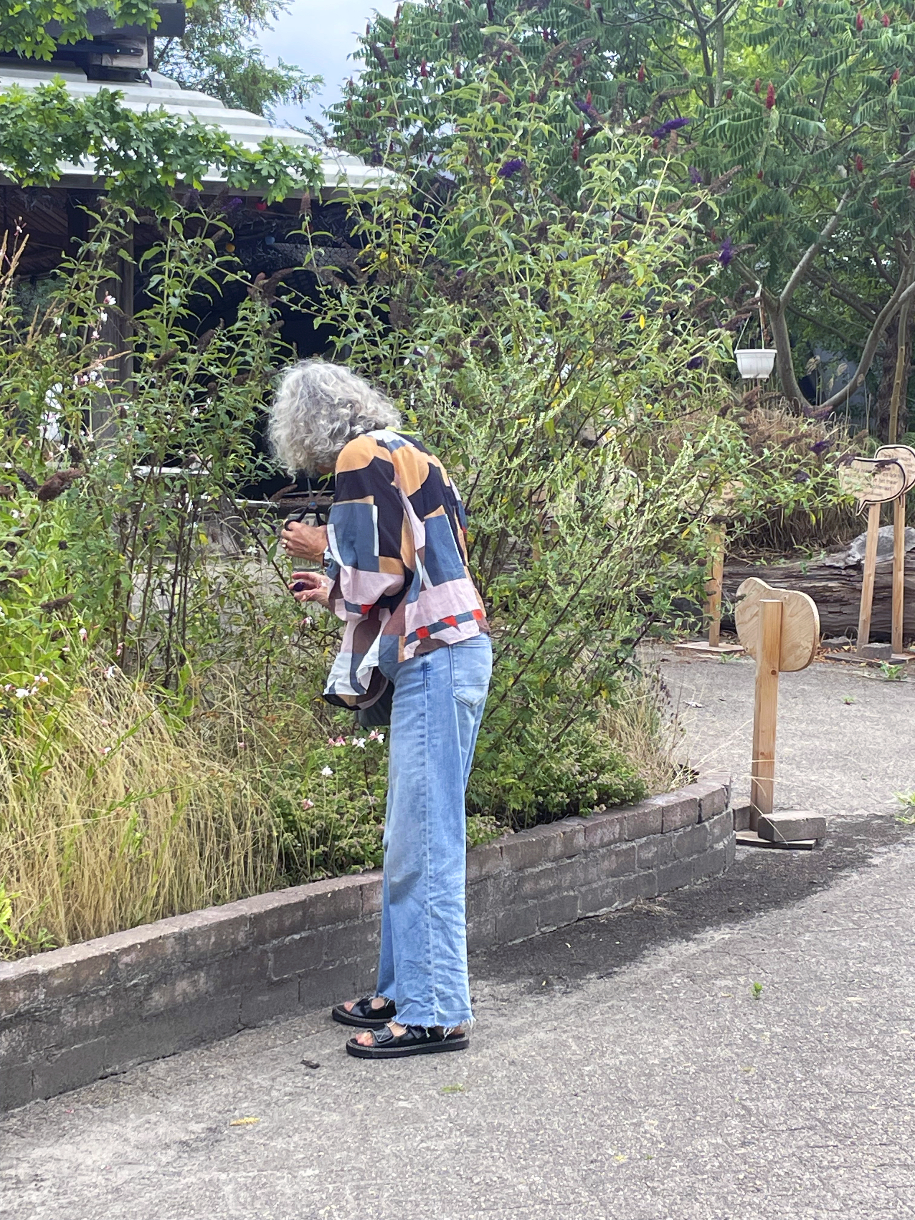
Over the past year, I’ve guided several colour workshops where participants went through their own process, from intuitively sensing colour to composing personal palettes and visual stories. Whether fashion students, garden enthusiasts, interior architects or textile designers, one insight kept resurfacing: intuitive colour choices open up stories, spark dialogue and create unexpected connections across disciplines.
![]()
![]()
In the coming months, I’ll be shaping the new Embassy of Colour program for next year – with workshops at inspiring locations, full of discovery and new collaborations.
10.08.2025
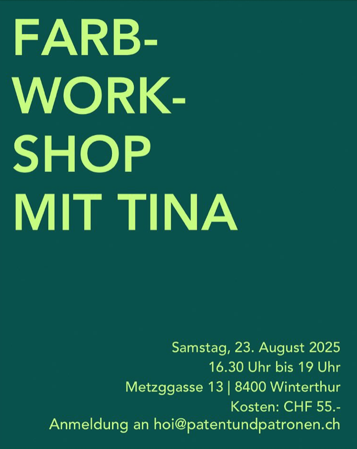
For all the spontaneous & curious
On August 23rd, I’ll be hosting a special colour workshop in Winterthur – at Eva’s brand-new store, @patentundpatronen.
• Are you working on a personal project?
• Do you want to learn how to create your own colour palette?
• Or simply enjoy an inspiring evening in a friendly group?
Then join us!
![]()
What to expect:
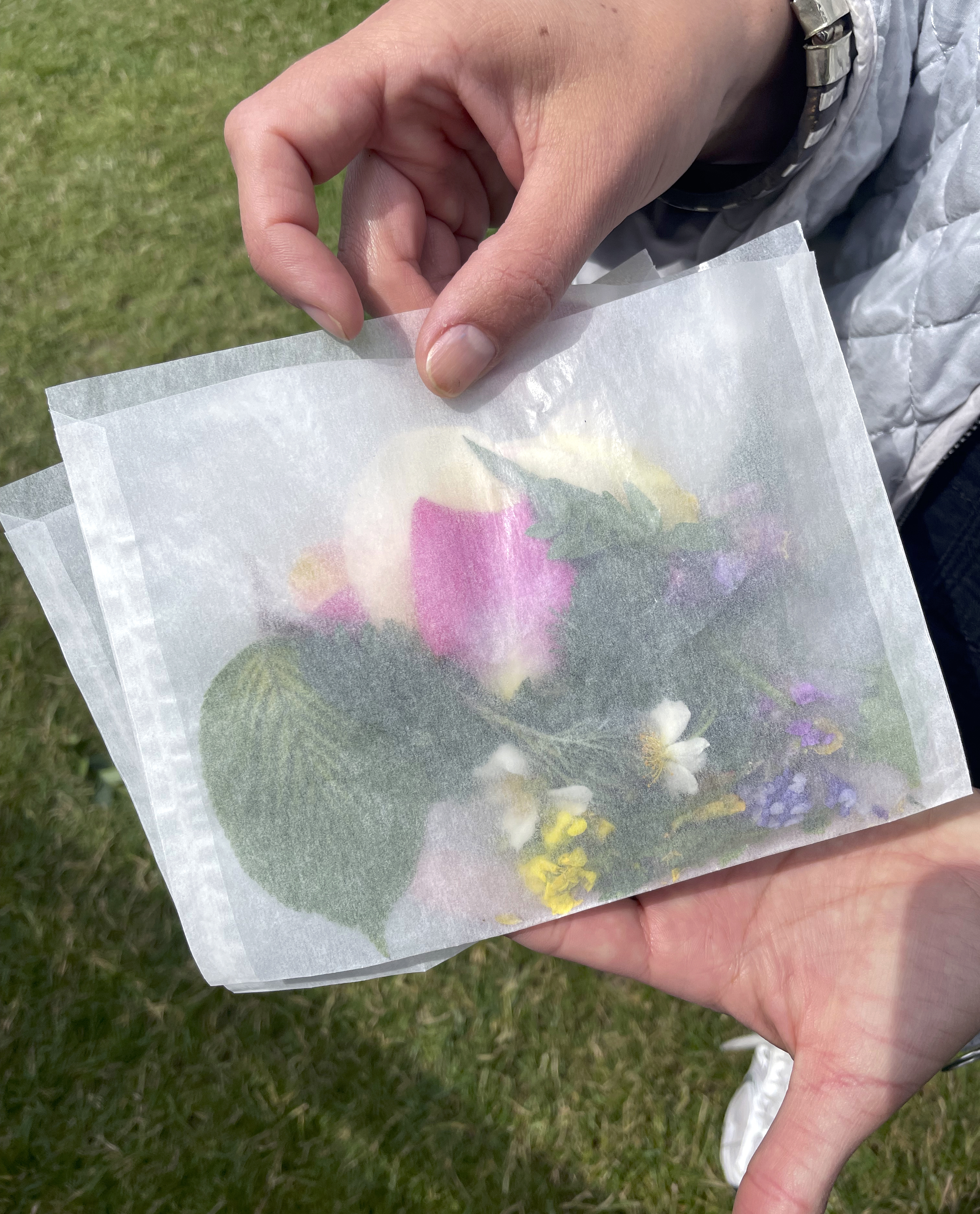
Discover the hidden colours of the city. After a short introduction, we’ll go on a colour exploration tour – observing, collecting, and combining. At the end, you’ll take home your own colour cards & palette.
I’m looking forward to seeing you!
https://www.patentundpatronen.ch/
13.06.2025
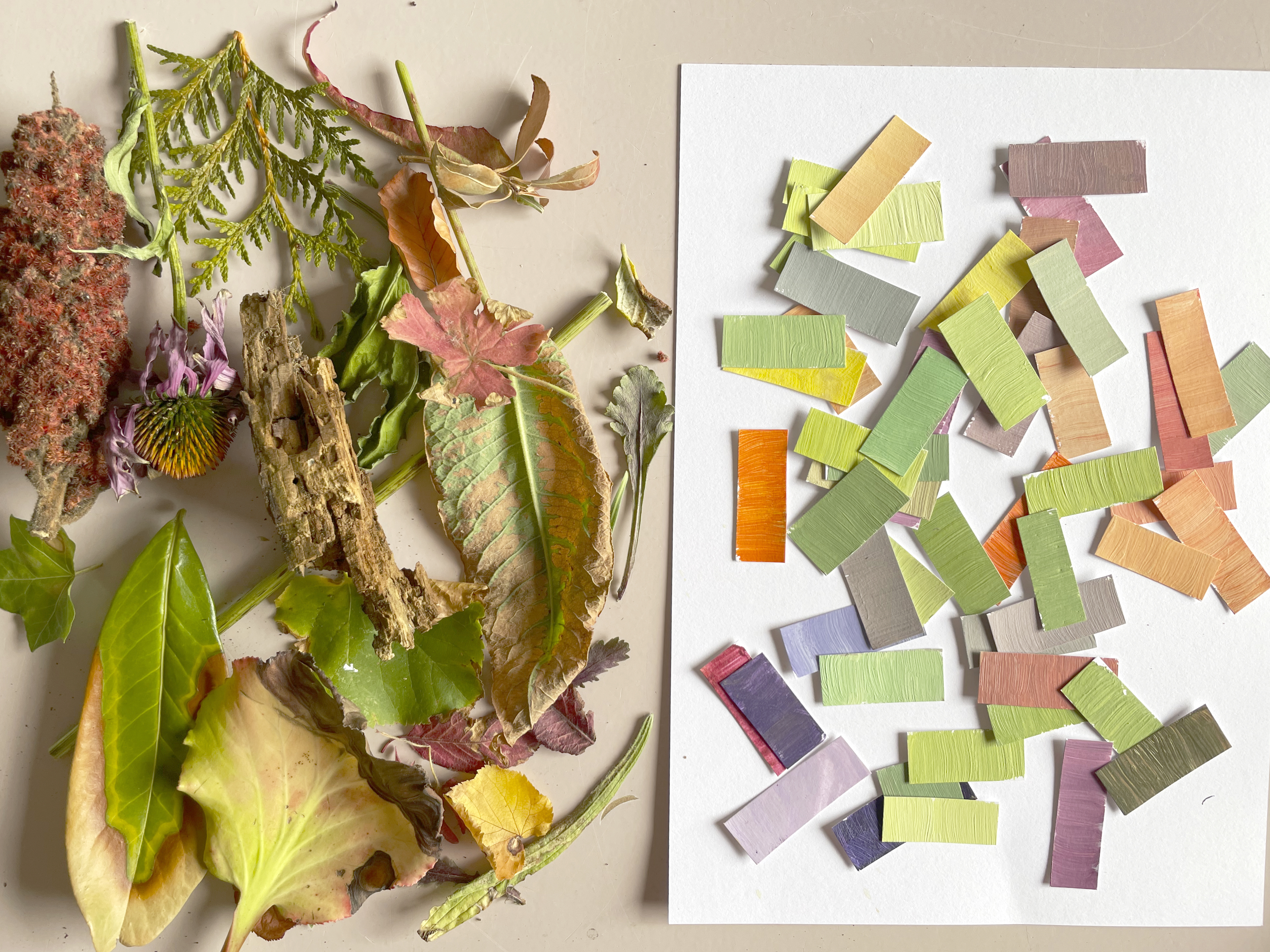
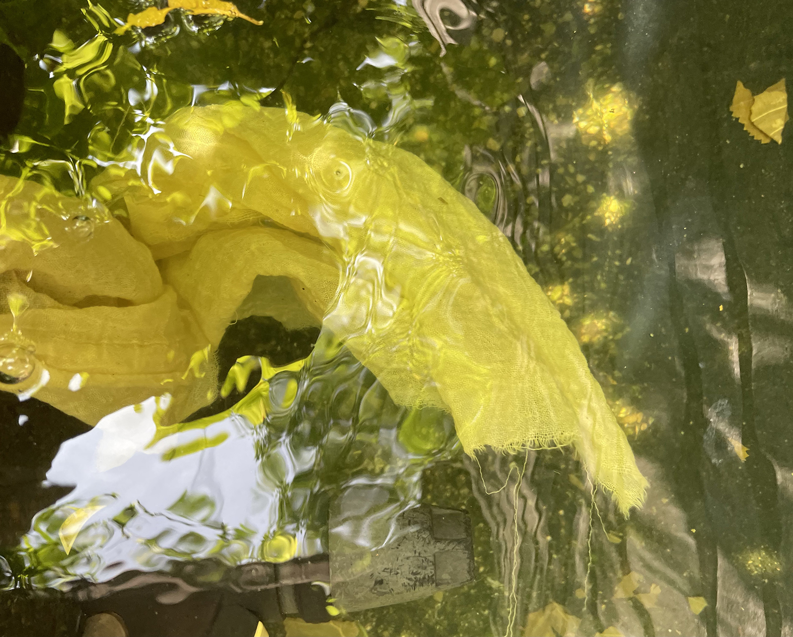
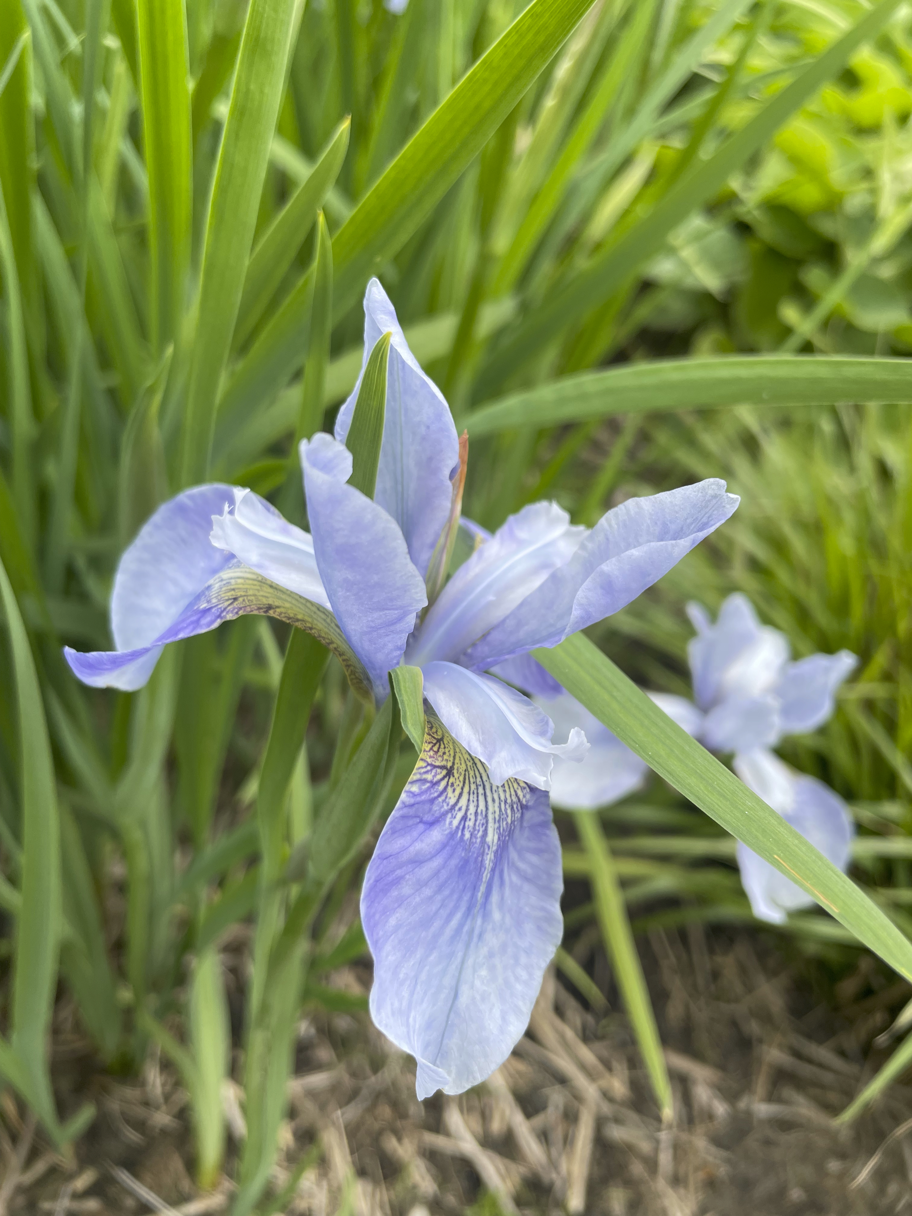
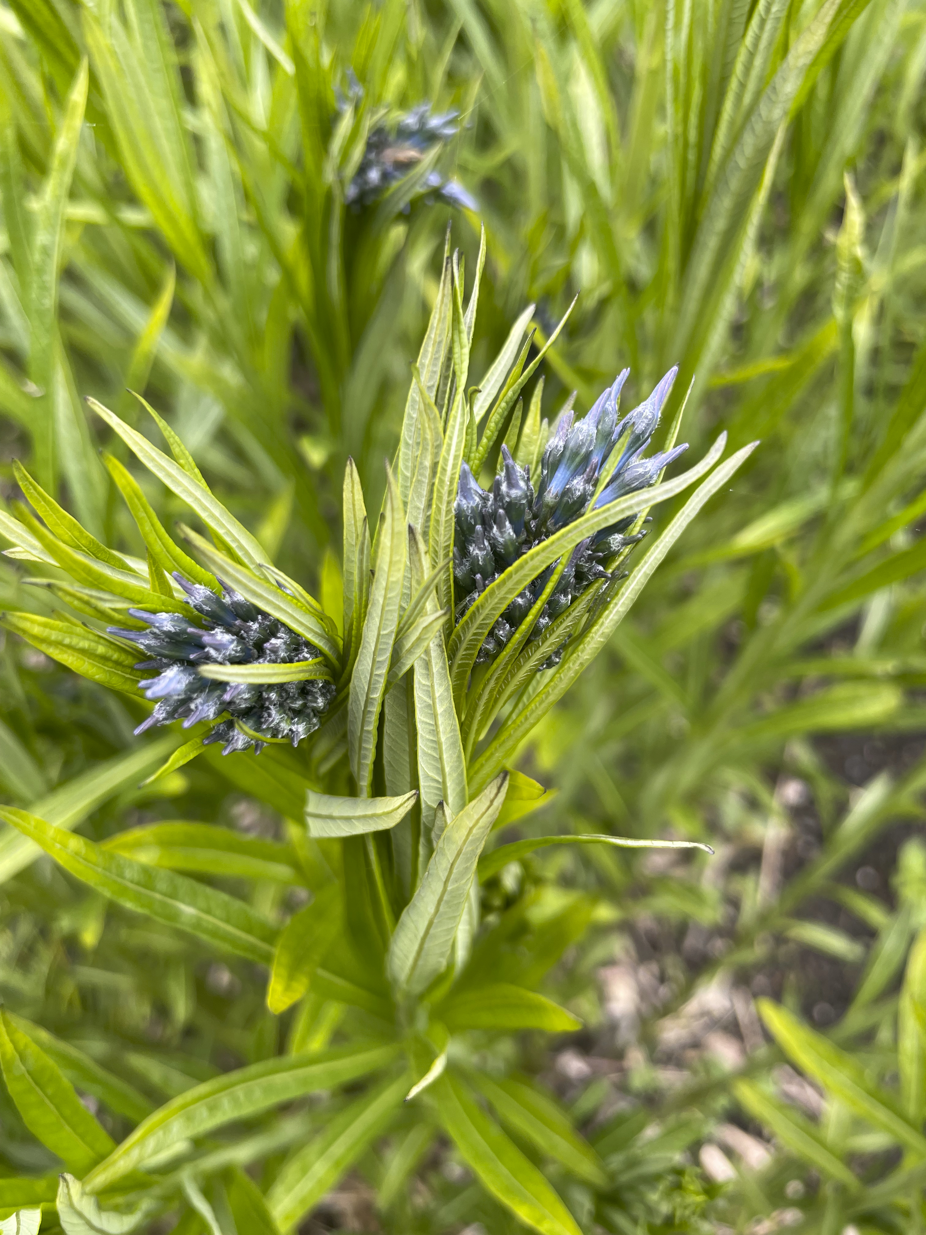
What if your next colour concept didn’t come from a trend forecast or Pinterest board… but from a walk around the block or your garden?
![]()
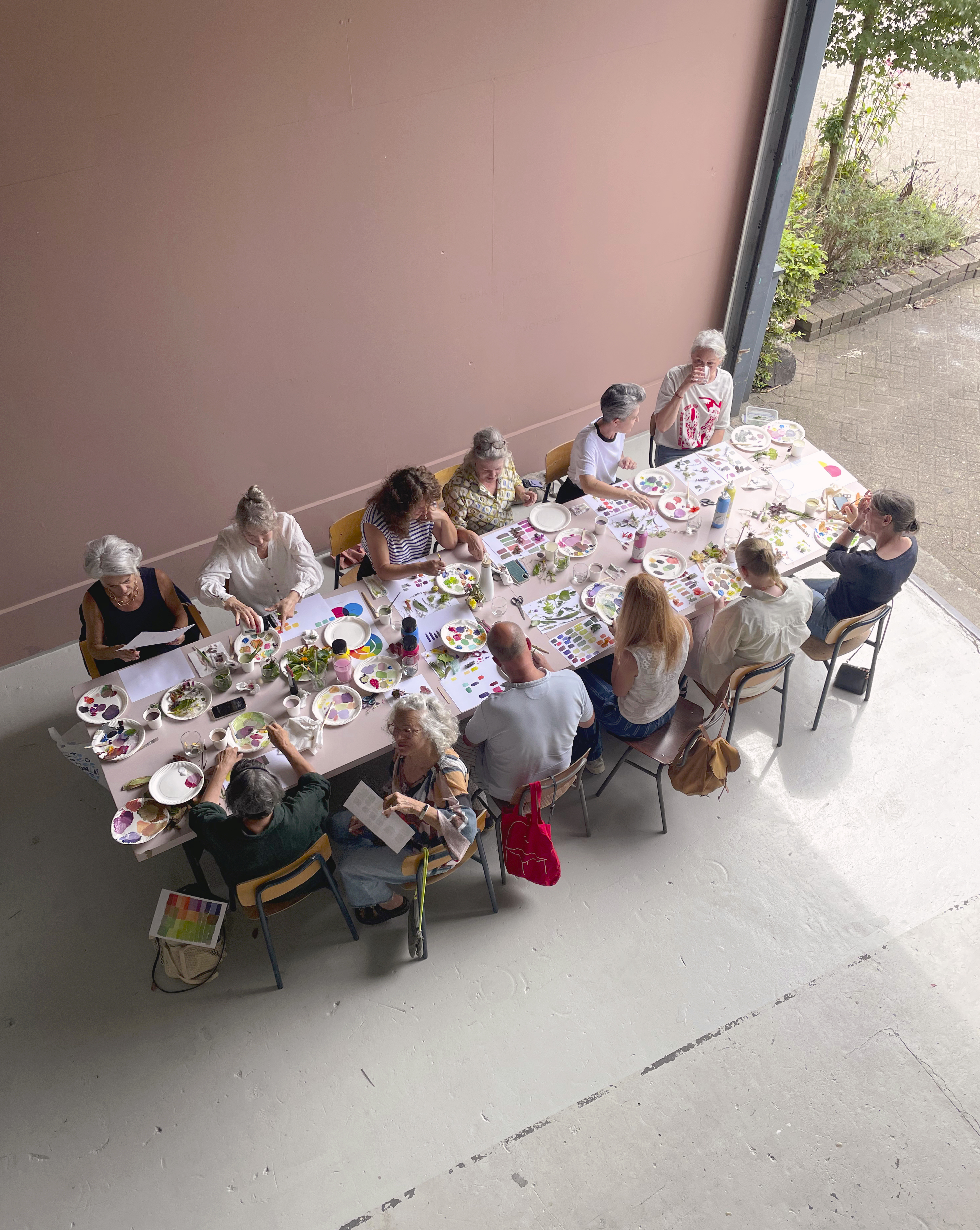
Lately, I’ve been focusing on how we can experience colour in a more hands-on and intuitive way — moving away from seasonal palettes or algorithmic suggestion, and instead connecting colour to real environments and materials. How can we make colour more tactile, personal and grounded in place?
This approach has shaped my recent workshops and projects within my Embassy of Colour, where I’ve discovered colour’s power as a bridge between people, places, materials, and forms.
![]()
![]()
Images: Colour Workshop in July at Sectie-C in Eindhoven

COLOUR EXPLORATION
︎HOME
Beyond its commercial applications, the studio explores colour as a phenomenon shaped by culture, emotion, and ecology.
Colour is a deeply sensory experience—closely tied to our emotions, identity, and cultural background. It influences how we interpret the world around us. Yet in today’s fast-paced, globalized context, colour is often treated as interchangeable, losing its connection to place, history, and the natural world.
PROJECTS
︎︎︎
THE COLOURS OF A FOREST
SEASONAL COLOUR WHEEL
‘The Colours of a Forest’ is a year-long search for the seasonal colour transformations of the Dommelplantsoen in Eindhoven. The project captures the essence of nature's constantly changing colour palette and reflects its transient and dynamic nature.
DISCOVER MORE ︎


COLOUR RESEARCH
SIRPA’S GARDEN
Can the memories of specific moments in certain places be captured through colour?
The project "Sirpa's Garden" explores the hidden colors in my mother's garden in Switzerland, where I frequently spend my summers.
READ MORE ︎
MUSEUM VOORLINDEN
SEASONAL COLOURS OF THE MUSEUM’S GARDEN
The garden at the renowned Museum Voorlinden in the Netherlands was designed by Piet Oudolf, a celebrated landscape architect known for iconic projects such as New York’s High Line.
The museum commissioned a project to map the garden’s colours, with the goal of creating several colour compositions and a seasonal colour chart that showcases the shifting shades of the plants throughout the year.
The project is scheduled for completion by the end of 2025. More info to come soon.
COLOUR STUDY
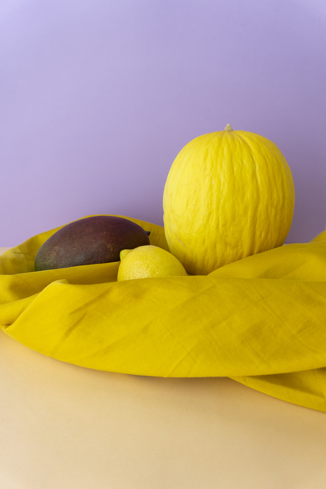
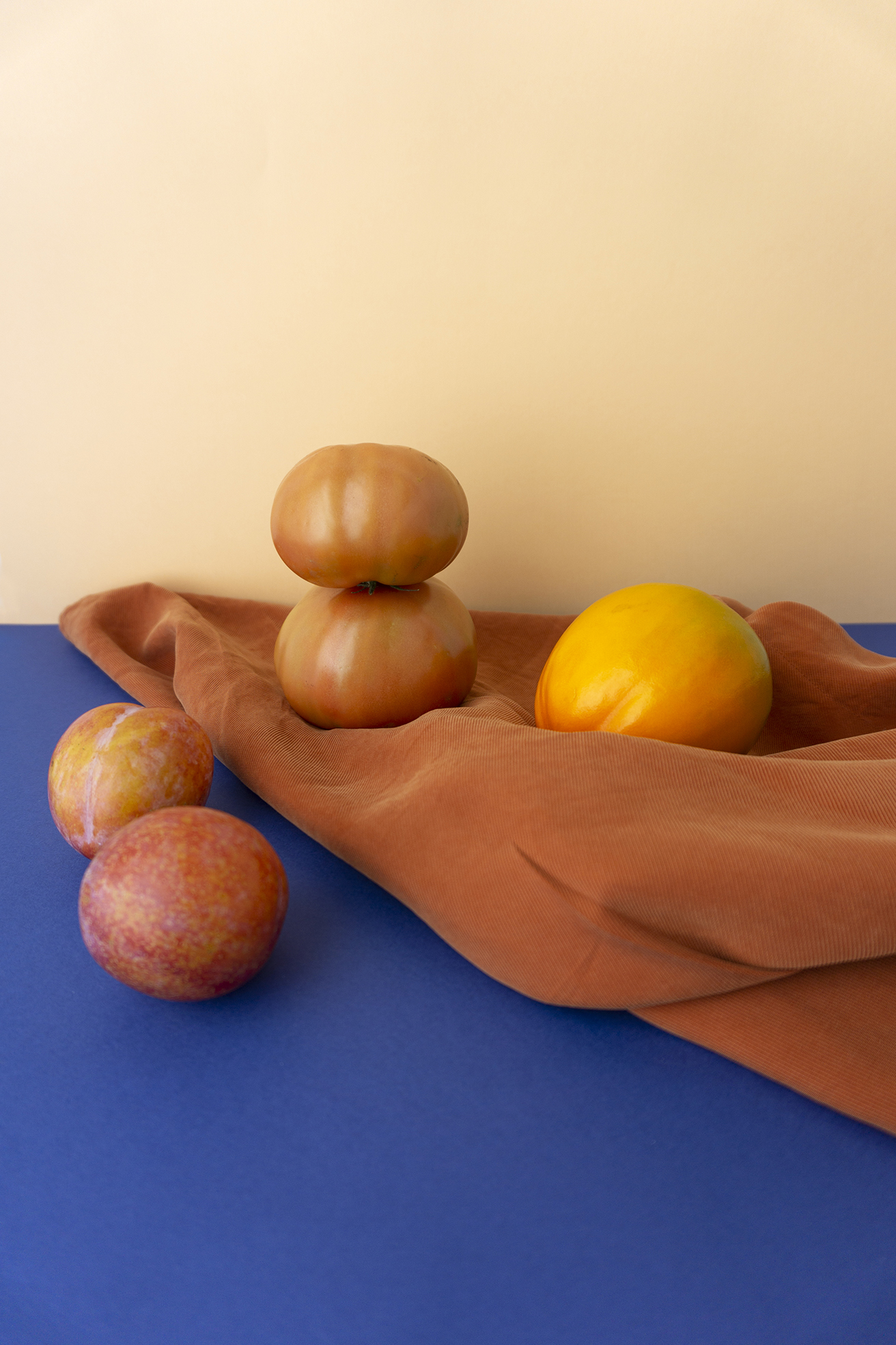
COLOURS OF OPTIMISM
How does the interplay of color with material, structure, shape, and light stimulate our senses? How can specific colours enhance our well-being and facilitate a reconnection with ourselves?
DISCOVER MORE︎


BOLD&PLAY
COLOURS OF OPTIMISM
Colour unfolds its beauty in combination with other forms, materials, surfaces and light. Blended or blocked, colour stimulates our senses and plays a significant role in the way we experience the world around us.
I am passionate about colour. And I am wondering; what are the colours of crisis? Which colours enhance our well-being and enable us to re-connect with ourselves in times of uncertainties and disorientation?
We need colours that convey confidence and optimism. Warm tones give us a feel of comfort and enable us to feel grounded. Sparkles of bright colours such as yellow or pink represent energy and trigger our curiosity. Combined with soft and tactile materials we re-gain the feeling for the physicality of the place where we can connect to.